
Data Portal
Project Background
I had initially worked on visionary explorations for a Data Portal concept after noticing a gap in the product experience.
Several other teams at Confluent also needed a Data Portal at the same time, so I took the initiative to lead the design for this. I created a holistic vision that addressed the needs and goals of our users while maintaining alignment with the different teams.
Another constraint was a tight timeline as we had a goal of announcing this feature at Confluent’s annual developer conference.
Role
Product Designer
Responsibility
End-to-end experience
Worked with
1 PM Director, 2 FE Engineers
Stakeholders: 3 other teams
Goal
Provide a better way for developers to easily discover and access their data

Alignment Workshop
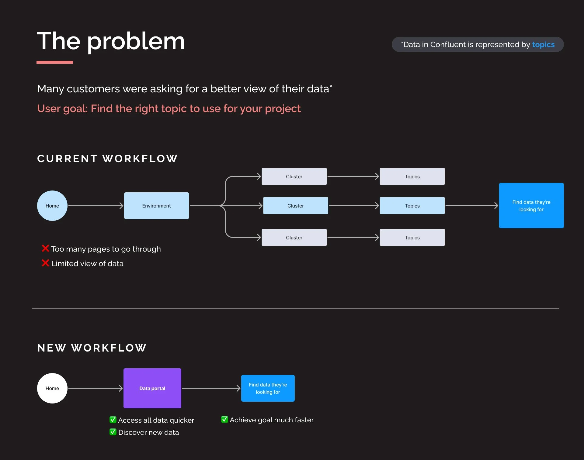
This project had 3 other teams involved. One of my most important goals was to ensure a holistic user experience. To do that, I needed to gain clarity from those teams to understand their challenges and needs.
I led a workshop with those teams to identify the different user goals and challenges they wanted to solve with the Data Portal.

Categories based on user’s activity and interests
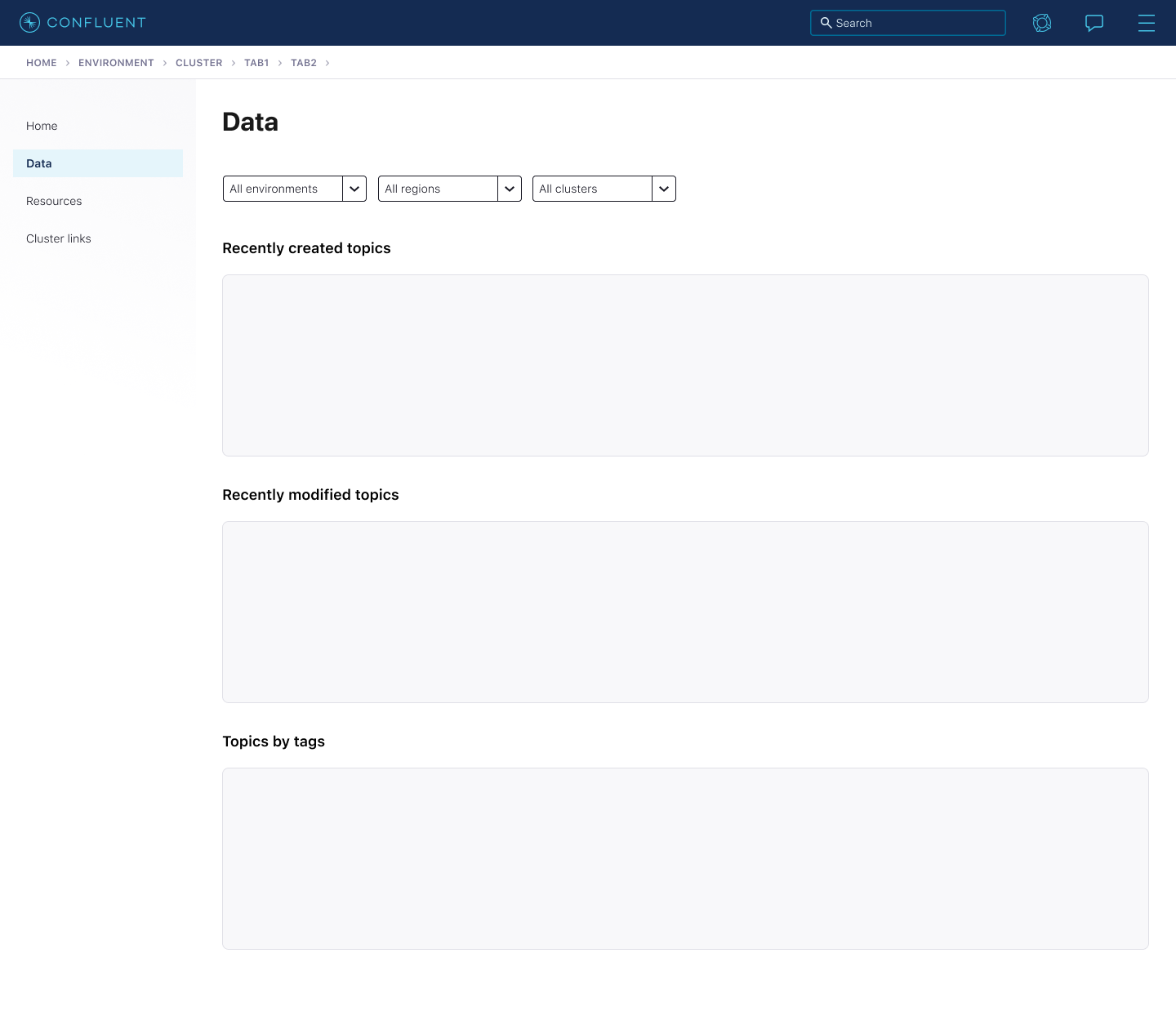
Wireframes
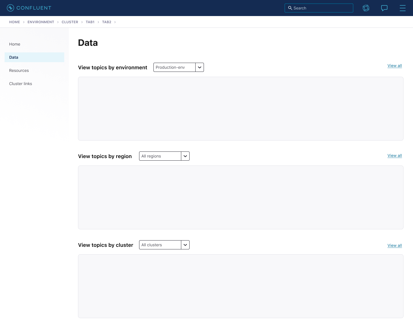
Categories based on existing structure
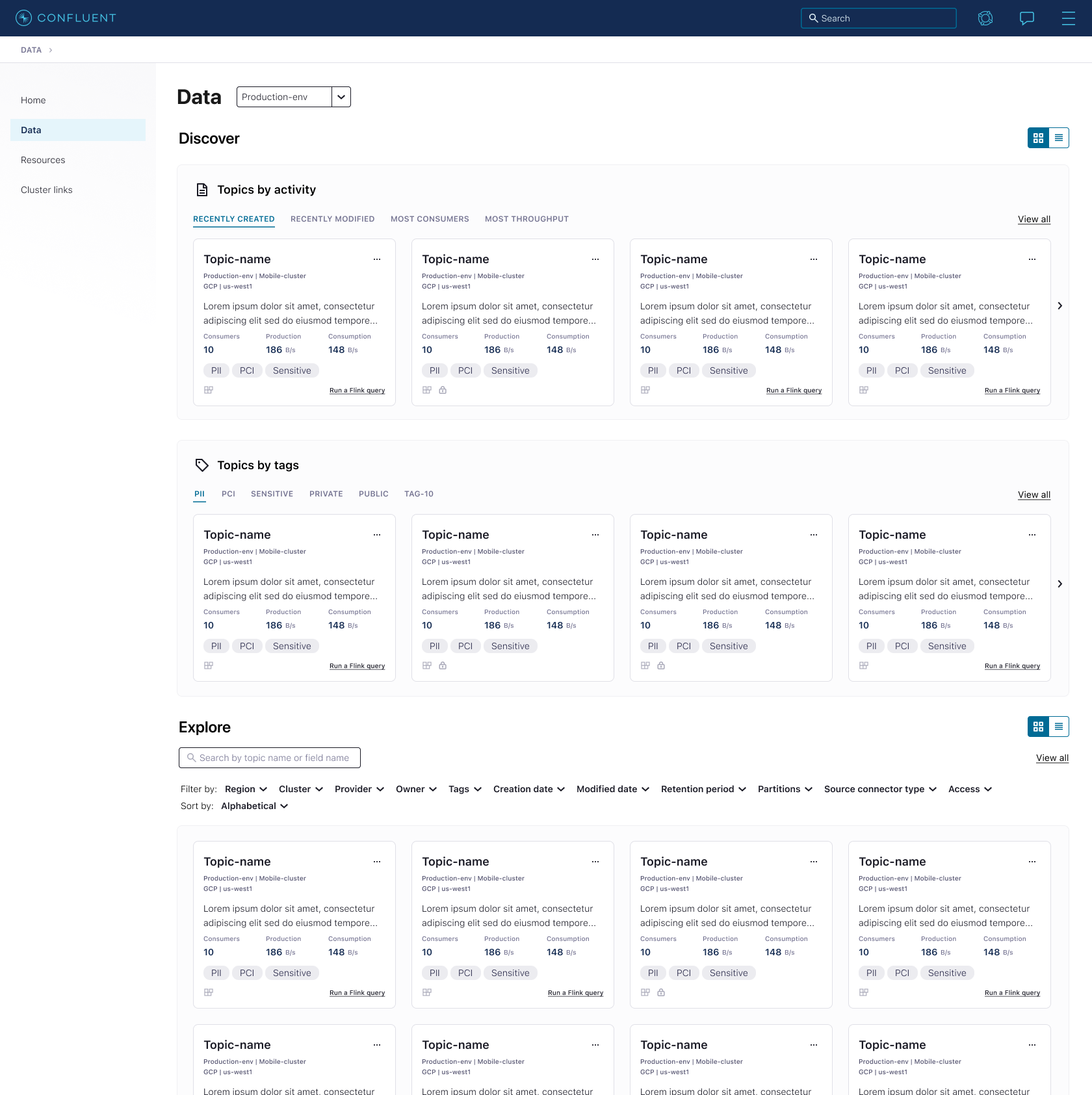
Different options explored on how to display the data for this page. Decided to organize it based on the user’s activity and interests - breaking away from the current pattern of how data was organized.
Lo-Fi explorations
User research
Due to many conflicting opinions on the best way to categorize and show data, I conducted user research to find out what users actually wanted. I spoke to 3 customers and 6 internal people with customer-facing roles.
I shared designs to get feedback, validate the design direction, and find out what is most useful for them to see.
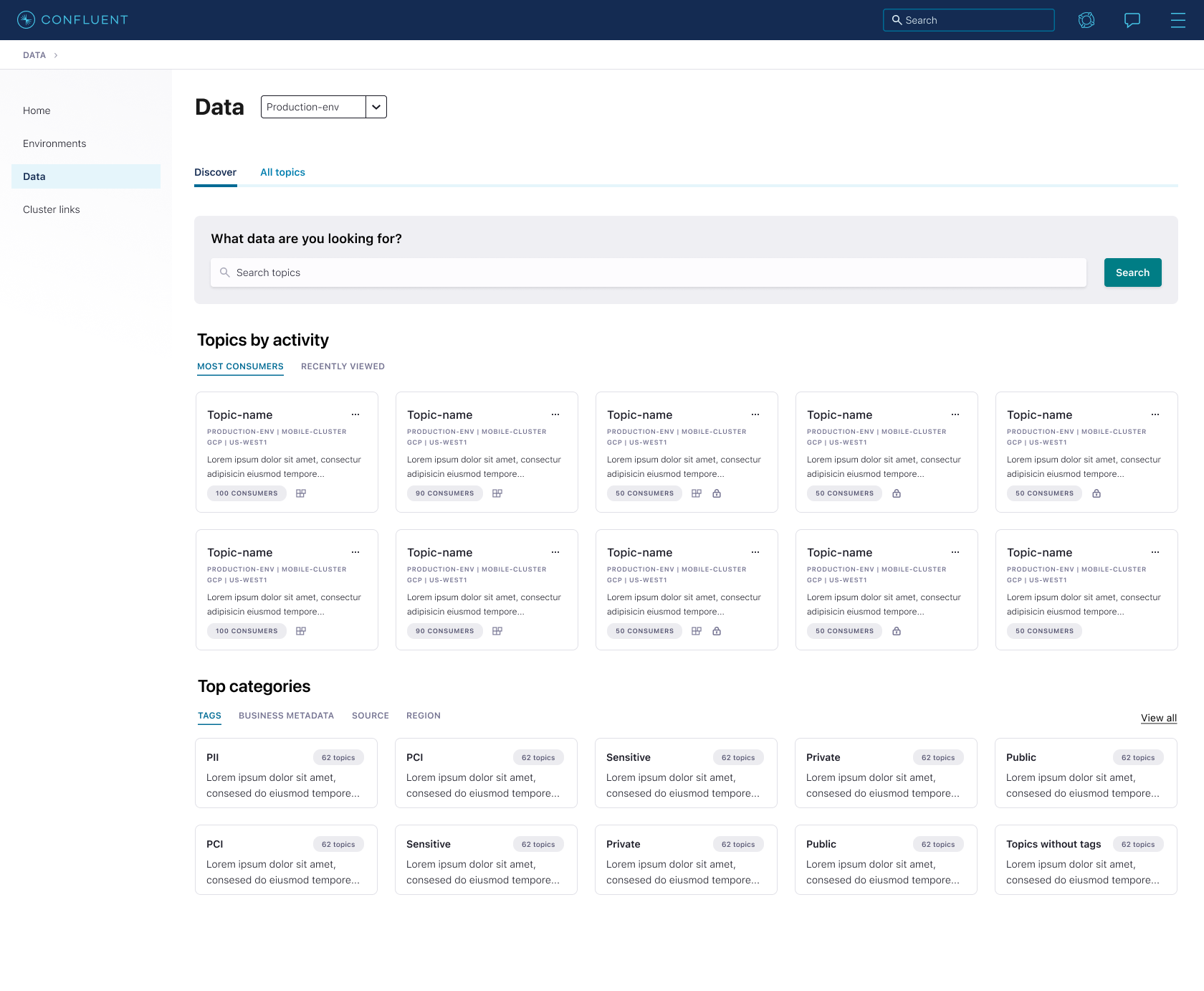
From those conversations, I gathered that the most useful categories of data for users would be: topics organized by tags, topics with the most consumers, and recently viewed topics.
“It’s really something we were planning to build ourselves”
“Most people will use tags”
“Developers working on an application...will search directly.”
Final designs
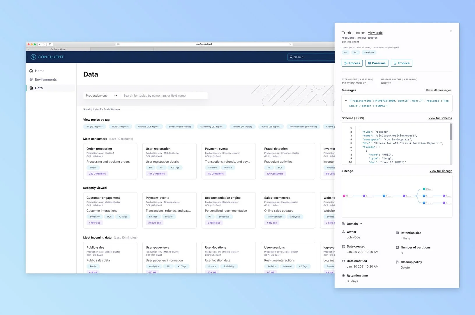
When you first land on the Data Portal, the search bar is prioritized for users who already know what they’re looking for. The rest of the page focuses on discoverability, providing new views of their data, categorized based on what users would be most interested in seeing.

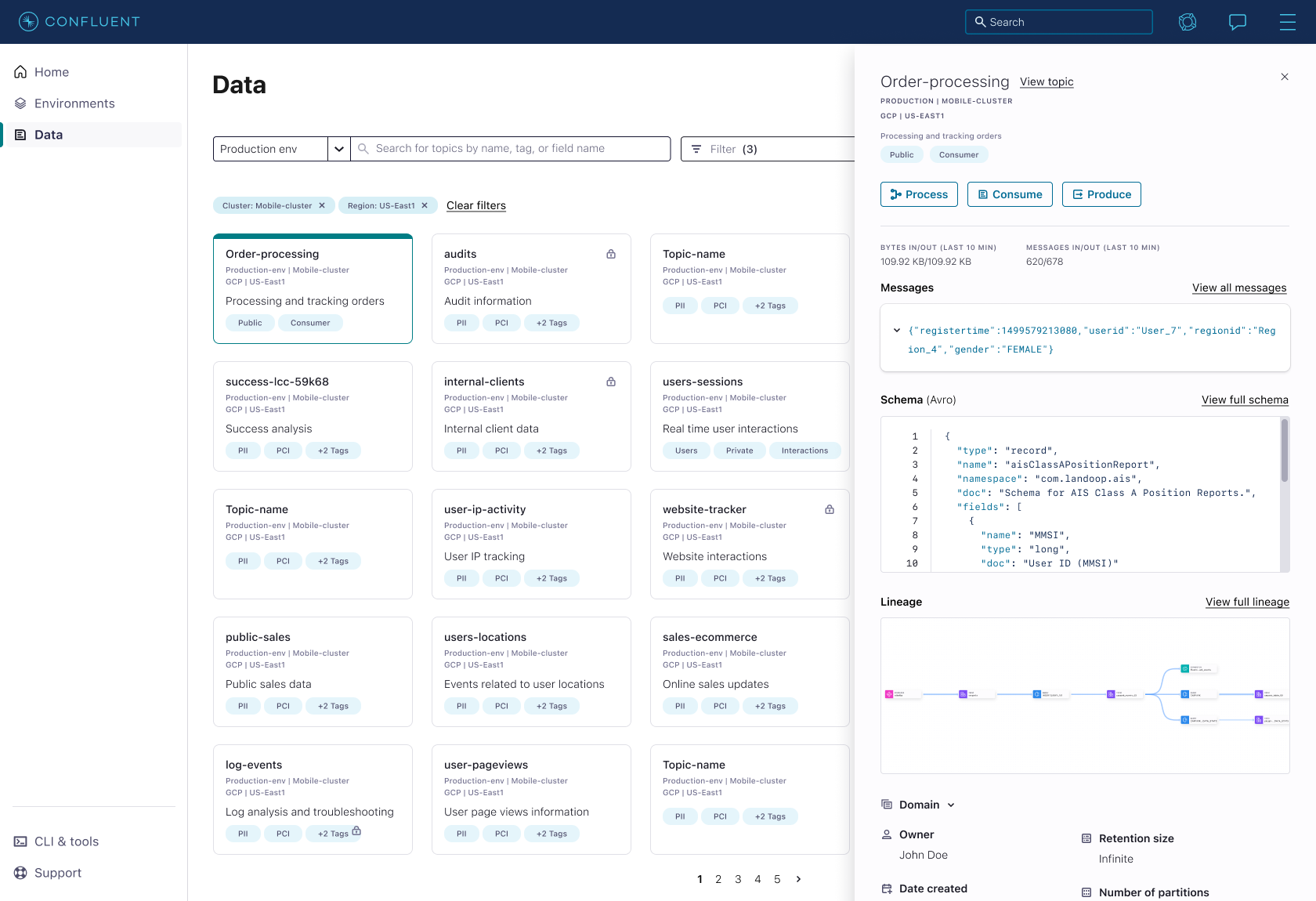
Once the user finds a topic, they can select it to learn more. A preview panel shows up with more details about the topic. From there they can learn more or take action. Now there is a central place for them to understand their data better and easily take action.
Conference demo
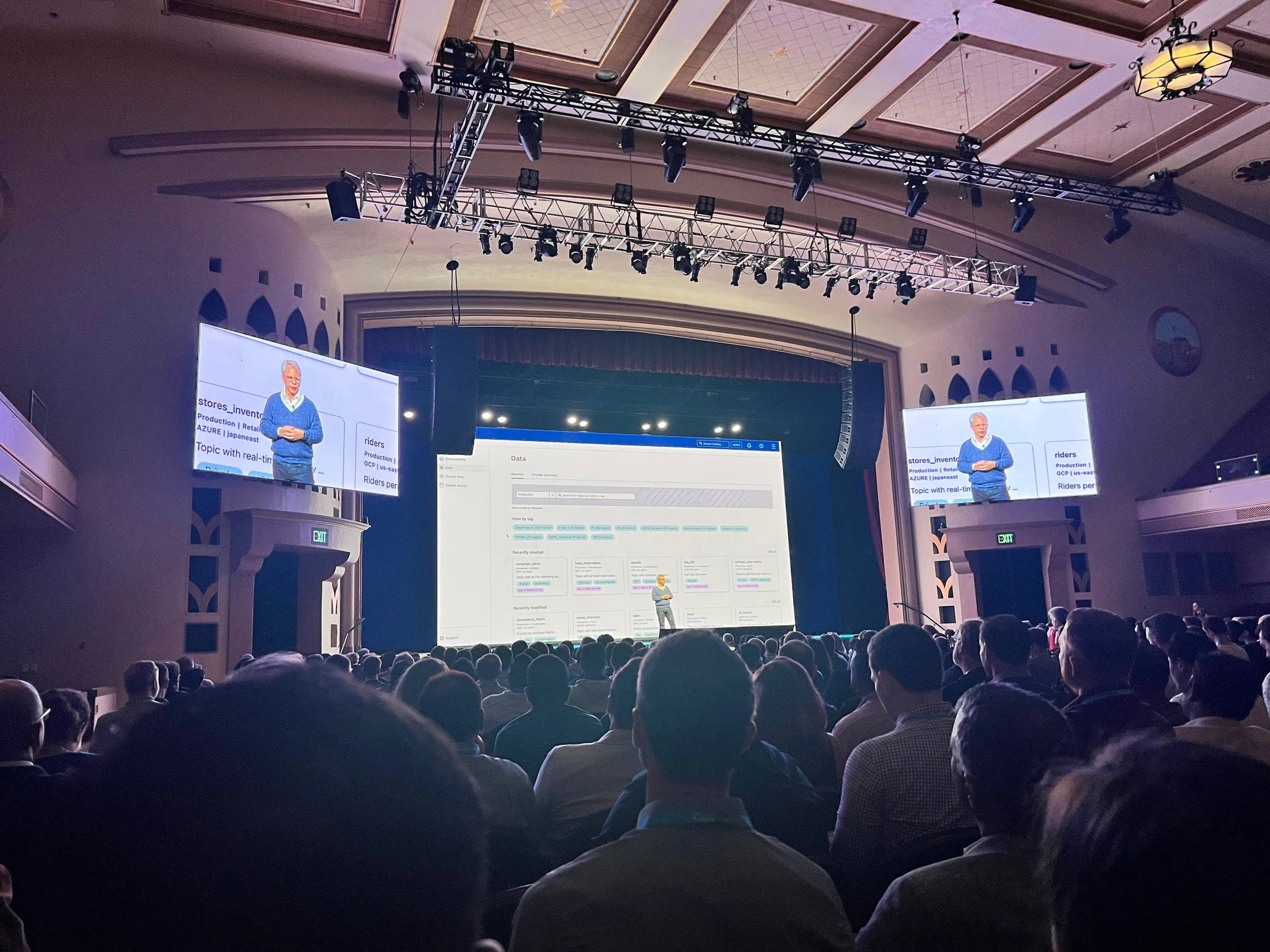
Data Portal was announced and demoed at Confluent’s annual developer conference, Current.
There was a lot of excitement from customers on how to start using this feature immediately after they saw the demo.
Impact
Business Impact
Acquisition: 63% of users going to Data Portal
Adoption: 70% of those users taking action on a topic through Data Portal
Continue Learning & Iterating
What categories/filters are most used?
What action do most users take after finding a topic?
What could be preventing users from using Data Portal?
Design Impact
Introduced new pattern (Preview panel) that other designers were able to adopt and utilize.
Team Impact
Initially helped 3 teams with a need for Data Portal. After launch, now additional teams can benefit and utilize Data Portal .